Creating and Editing
Entity dashboards
Dashboards are either associated with:
a specific entity: useful to create a unique dashboard for a particular entity, or just to get started.
a label: Much more reusable and will allow you to choose which entity you want to see displayed on the dashboard.
Layout
The dashboard creator enables a simple approach to dashboard layout: adding rows and columns. The goal is to creat a layout that will fill/fit the screen at a variety of screen sizes with minimal fuss.
Add row
Starting from a blank dashboard, adding a row will add a full width card. Adding a row to an existing column will push another card into the vertical stack. Adding rows will keep the cards vertically aligned.
Add column
Adding a column will divide the horizontal space evenly. Rows don't have to have the same number of columns. Adding columns will keep the cards horizontally aligned.
Split card
Splitting a card is similar to adding a column, but instead of dividing the entire row, it will divide the "cell" by converting it to a new row and adding column. This enables non-symmetric layouts.
Fixed width
You can limit the horizontal size of a card by setting a fixed width. Other cards on the row will grow/shrink to fill the remaining space.
Fixed height
Likewise you can set a fixed height on a card. Other cards in the same row will grow/shrink to match.
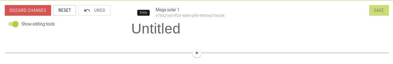
Discard changes
This will discard any changes you have made and return to the entity dashboard page. There is no request for confirmation.
Reset
This will put the dashboard back to its original state. For new dashboards, this means an empty page. For existing dashboards, it will return to the starting configuration. This action can be undone.
Undo
Undo the last action. You are able to undo all your changes since you started the current edit.
Show editing tools
To get a more accurate view of the current layout, you can disable the editing tools. You can still configure cards, but the drag and drop and Add buttons are removed.
Reorganising
You can use drag and drop to reorganize your dashboard cards. There are two types of "grab handles": rows and columns.
Swapping rows
When hovering over a drag handle, it will highlight the area that will be moved. Rows can be swapped with other rows.
Swapping columns
Likewise, columns can be swapped with other columns.
Limitations
Due to the nature of drag and drop, it's not possible to drop a child card onto a parent. However, you can still do the swap by dropping the parent onto the child.
Cards
Now that you've got the layout you're after, it's time to start picking out what will appear on the cards.
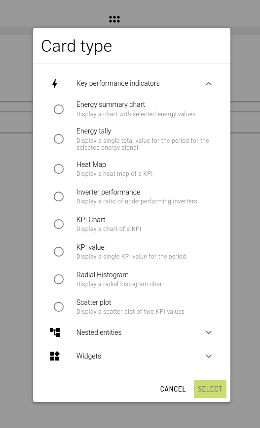
Select card type
Simply left click on the card and click Select card type. This will bring up a dialog box offering you a wide selection of card types grouped into categories
For a full list of card types and what they look like, see Card types. After choosing your card type and clicking Select, you'll be taken to the Card Configuration dialog.
Configure card
Simply left click on the card (that already has a card type) and click Configure card. This is the same dialog that will automatically open after initially selecting the card type. The configuration options for each card will differ and are described in detail under each Card types.
However there are some general options:
Title
This is the title that will appear at the top of the card. This is a free text field. The default font size is 18px. You can also adjust the font size by entering the desired size (in pixels).
Description
This is a markdown text area for writing detailed information or instructions about the content of the card. Markdown is a way to add formatting to text, such as bold and bullet points, using only special characters. For those unfamiliar with markdown, please click on the information icon for a brief introduction to the options that are available.
Last updated