Search Analysis
Using search analysis
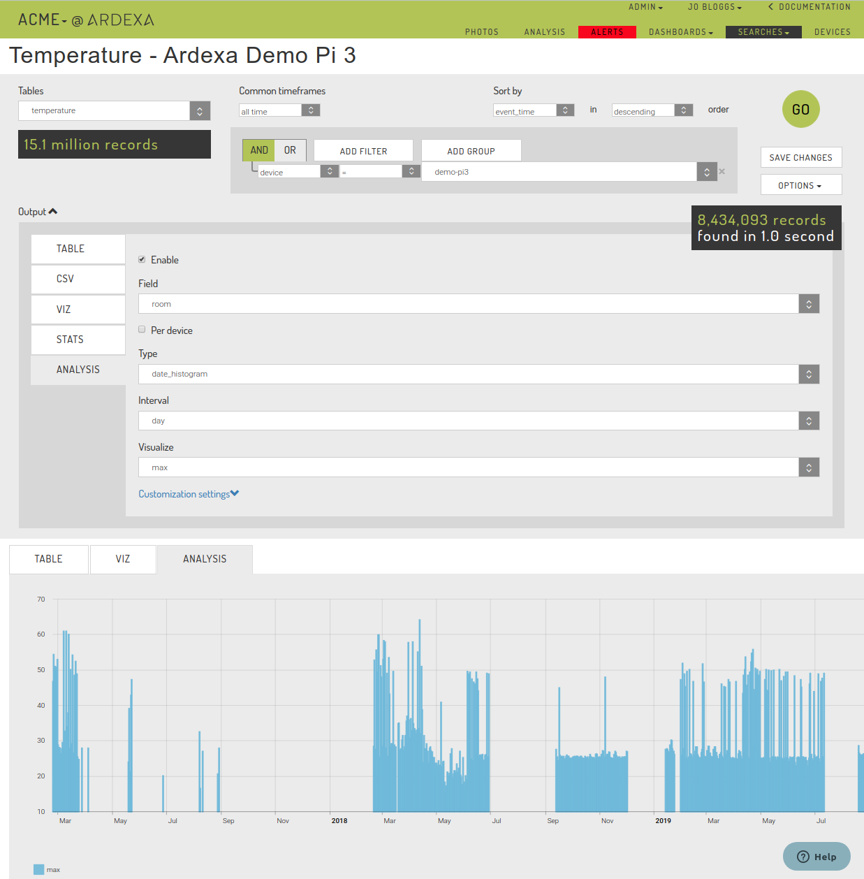
Using [SEARCHES] > [ANALYSIS], the Ardexa Web App provides you a visualisation tool to plot your statistical results generated from your searches.
Building your Analysis Plot
The following will step you through the process of building an analysis plot.
Note: Analysis can only be built against numerical data type fields.
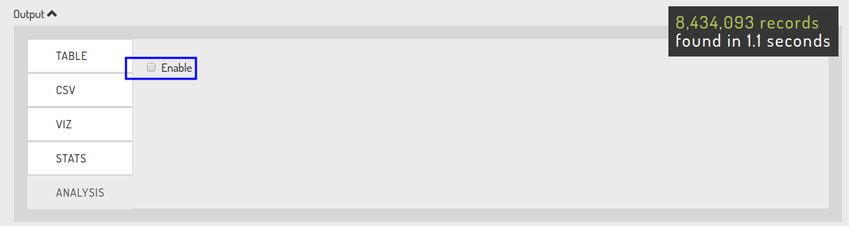
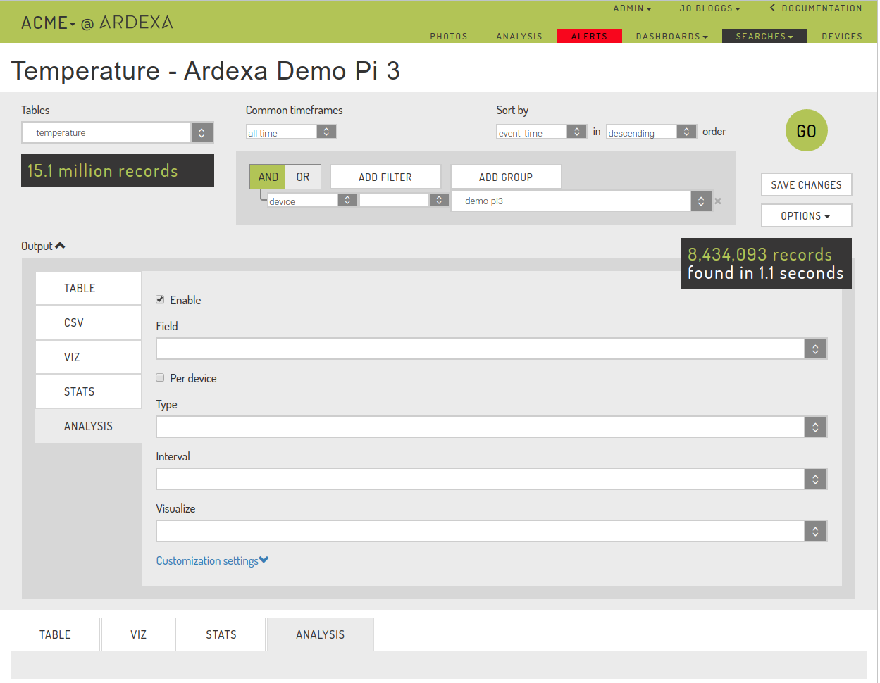
Enable ANALYSIS for your Search
Select the [ANALYSIS] tab and enable analysis via Enable checkbox. This allows you to begin building your analysis plot.
Run a Search
We have to generate some search results for our analysis, so we run a search to get some results. All the search input parameters will be used to generate the data that the Analysis plot will be built from.
Select your Analysis Output Parameters
Select the [Output] to expand the Analysis output parameters if they are hidden. This is where you will define what the Analysis chart will draw and how it will be display.
Field
Select a numerical field type from the drop-down list.
If you don't see an expected field it will likely mean the field has not be defined correctly in your Ardexa device's metadata.
Per device
This checkbox allows you to limit an analysis to be applied per device where a data set is built from more than one source.
Type
Typically all data is captured against date and time.
Interval
dayorhour- the finer the granularity of data being used in the evaluation will affect app responsiveness.day- faster,hour- slower.
Visualize
Select the statistical formula you would like to apply over your search results.
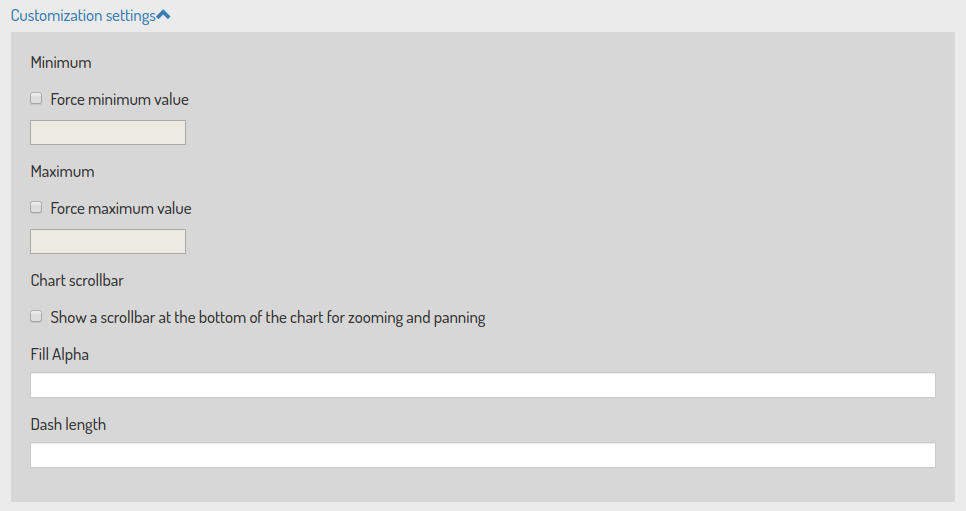
Customization Settings
The [Customization settings] are further parameters provided to help you sharpen your Analysis plot. Further descriptions on the available options are provided under STATS here.
Force Minimum and Maximum chart limits.
Out of the box, the VIZ will automatically chart your data and provide you a
y-axisthat best suits your data for the graph. However, you may want to chart based on fixed periods, for example in units of 10s, in which case you would select a Minimum of0and a Maximum of100.
Chart scrollbar
An instant on/off toggle provides you the means of condensing or expanding the graphed period of your search results. For example, say you see an interesting pattern in a period of you graphed search data, using the toggle you can can zoom-in and just focus on that period.
Fill Alpha
Dash Length
Run the ANALYSIS Charting
Last updated