Charts
Charts are integral to [ANALYSIS] tab. Here you will select your devices data to display data in a graphical format based on time periods.
On entry into the [ANALYSIS] tab, the Ardexa Web App will auto-load a list of your devices on the left-hand side of the screen.
Select a device to start. If tables have been defined against your device they will auto-appear as a list of sources below the selected device.
Select by checking one or more tables to work with.
Select a
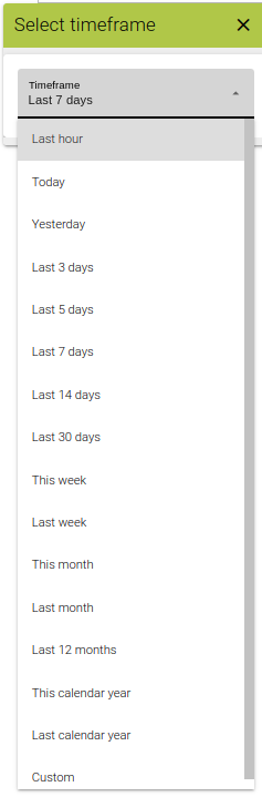
[Timeframe]Select from a list of available pre-defined
[Field]/sto display that data in a chart.Adjust the Chart Style if required. Options are
line(default) orcolumn
Your graph will auto draw
Timeframe Picker
Before selecting your source's fields choose an appropriate Timeframe that you would like to chart
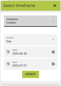
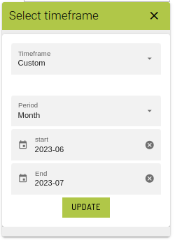
Custom Timeframes
Custom timeframes are also available to build your analysis for specific periods.
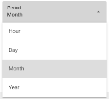
The timeframe picker offers you the ability to select a custom timeframe to suit your needs based on periods of:
Click on the calendar icon of the start and end date fields to chose your timeframe.
The timeframe is only applied when you click on the [Update] button.
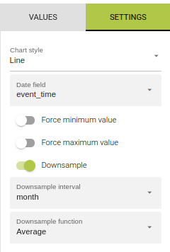
Chart Settings
This tab allows you to modify how your chart data is generated and change how it appears
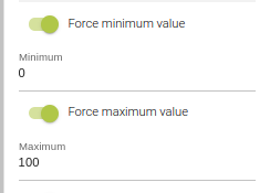
Set Minimum, Set Maximum
The data generated by your devices may return values above or below a threshold that you are interested for analysis. These toggle allow you to apply an upper and lower numerical limit.
Hint: limits apply to all datasets in the current chart irrespective of their data range.
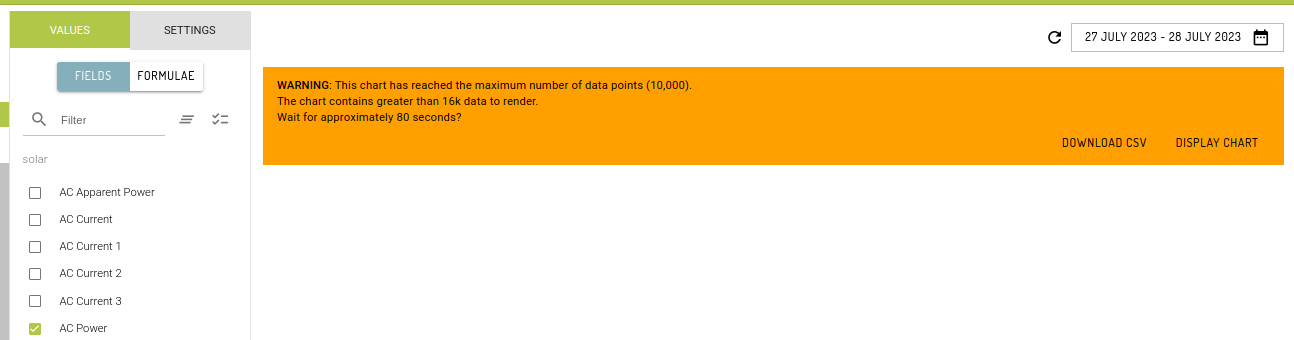
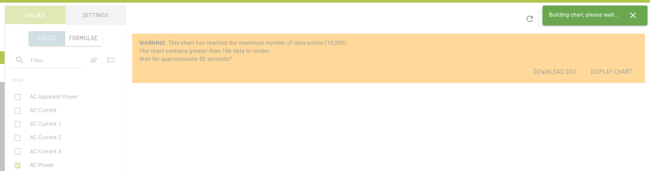
Improve Chart Performance
Your machines may collect data at a very high frequency. Bringing that data back from your tables to chart as un-aggregated data for Day timeframes will present a performance limit.
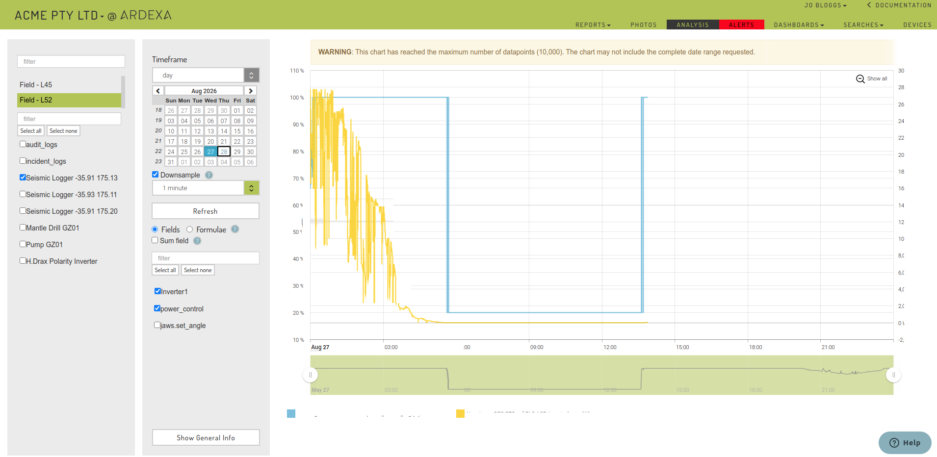
Once large data sets hits the limit of 10,000 data points, it will prompt a warning message. It will then present an option to either display the chart and wait for an x amount of seconds or to download a CSV data.
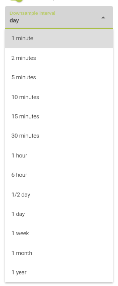
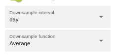
Downsample
Down-sampling allows you to generate charts over very large datasets to avoid the error above and improve performance of chart rendering.
For timeframes of Last hour ,Today ,Yesterday only, by checking the [Downsample] field you will then have the ability to choose a downsample [Interval] for your chart.
Other, larger timeframes, will enforce down-sampling. A default will be applied but you will have the opportunity to change that interval and function applied.
Hint: If available for your selected timeframe, select your down-sample interval before selecting your source fields for improved charting performance.
This feature is particularly useful for large datasets that will exceed the 10,000 data-point limit or otherwise causing performance problems in your charts. Downsampling can be used to chart result sets containing up to 250 thousand data points.
The aggregation applied to each minute interval is taken from [Fields] input field (auto-displayed to you when [downsample] is checked).
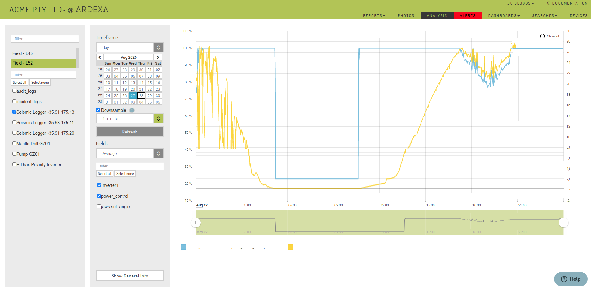
Example - Before Downsampling
Example - After Downsampling
Note:
Formulas cannot be applied to down-sampled datasets, i.e they can only be applied to
Last hour,TodayandYesterdayAll other timeframes, including
Customtimeframes are automatically down-sampled.
Warning: Under-sampling Down-sampling only works where the underlying base frequency (collected rate) of your data, stored in your table, is more frequent than the down-sample interval you select. i.e. the underlying table data should be collected in data/seconds for this to work effectively. Applying under-sampling to datasets with a collected base frequency greater than the selected interval may produce strange results in your chart.
Warning: maximum result set size
If a downsampled result set will exceed 250 thousand data points, a warning will be displayed, and the data will not be fetched by the system. If this happens, you will need to reduce the size of the result set by:
choosing a shorter timeframe
selecting fewer sources and/or fields
choosing a larger downsampling interval
Date fields
By default, the Ardexa agent records an event_time field when it captures an event. Some data stored in the Ardexa Cloud can contain one or more date time fields that reflect when an event actually occurred. This pattern is most common when an on-site system captures the data, which is then read by the agent at a later point in time. See event_time and Datetime for more information.
Analysis allows you to visualise data using a selected date time field. The default behaviour will attempt to resolve the appropriate date time field following these rules:
event_timeis the base default date time field for AnalysisIf a workgroup-level 'analysis date/time field' is active in the workgroup's settings, it will be used as the default in Analysis
If a date field is selected in the "Date field" drop-down on the Analysis page, it will be used as the default
If the default date time field is not present on a given table and source, the first date time field in the record will be used
If rules 2-4 are not able to provide a suitable date time field, Analysis will fall back to using
event_time
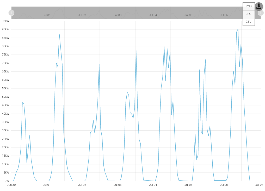
Exporting Charts
Any chart in the Ardexa cloud can be exported to an image or CSV file by clicking the download button at the top-right of the chart:
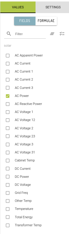
Chart Table Fields
Charting requires you select one or more fields to be rendered in your chart for the given timeframe.
In the analysis view
Select a device
Select a source under the displayed device
Select the
[TABLE FIELDS]tab in the analysis view.
A list of table fields will only populate when a device and a source are first selected.
Hint: Some table field lists will be very long. Use the filter above the list to narrow your search.
Danger: Selecting many multiples of table fields to render in the same chart may cause your browser to become unresponsive.
If this happens you may need to restart your browser.
Last updated