Search Visualisations - VIZ
Creating and using search visualisations
Why Visualise My Data?
Using [SEARCHES] > [VIZ], the Ardexa Web App provides to you, a visualisation tool as a 'VIZ' to assist you in the interpretation of the data generated from your infrastructure devices.
Search results in tabulated form provides a limited insight into your data trends. Charts, graphs and histograms are always easier to follow and can be used to discover trends and patterns that you would not otherwise be able to see from raw data or related data.
The Ardexa VIZ Tool - Saving you Time
Why consume your time exporting search result data to a csv and building charts in a spreadsheet when you can do it right within the Ardexa Web App and share your 'VIZ' chart with other workgroup members - all done quickly and efficiently!
Furthermore, Ardexa Visualisations or 'VIZ' allow the charting of multiple data sets so that trends can be viewed against related data.
Note: A visualisation, or 'VIZ', can only be built against numerical data type fields.
Building and Viewing a 'VIZ'
The following will step you through the process of building a VIZ.
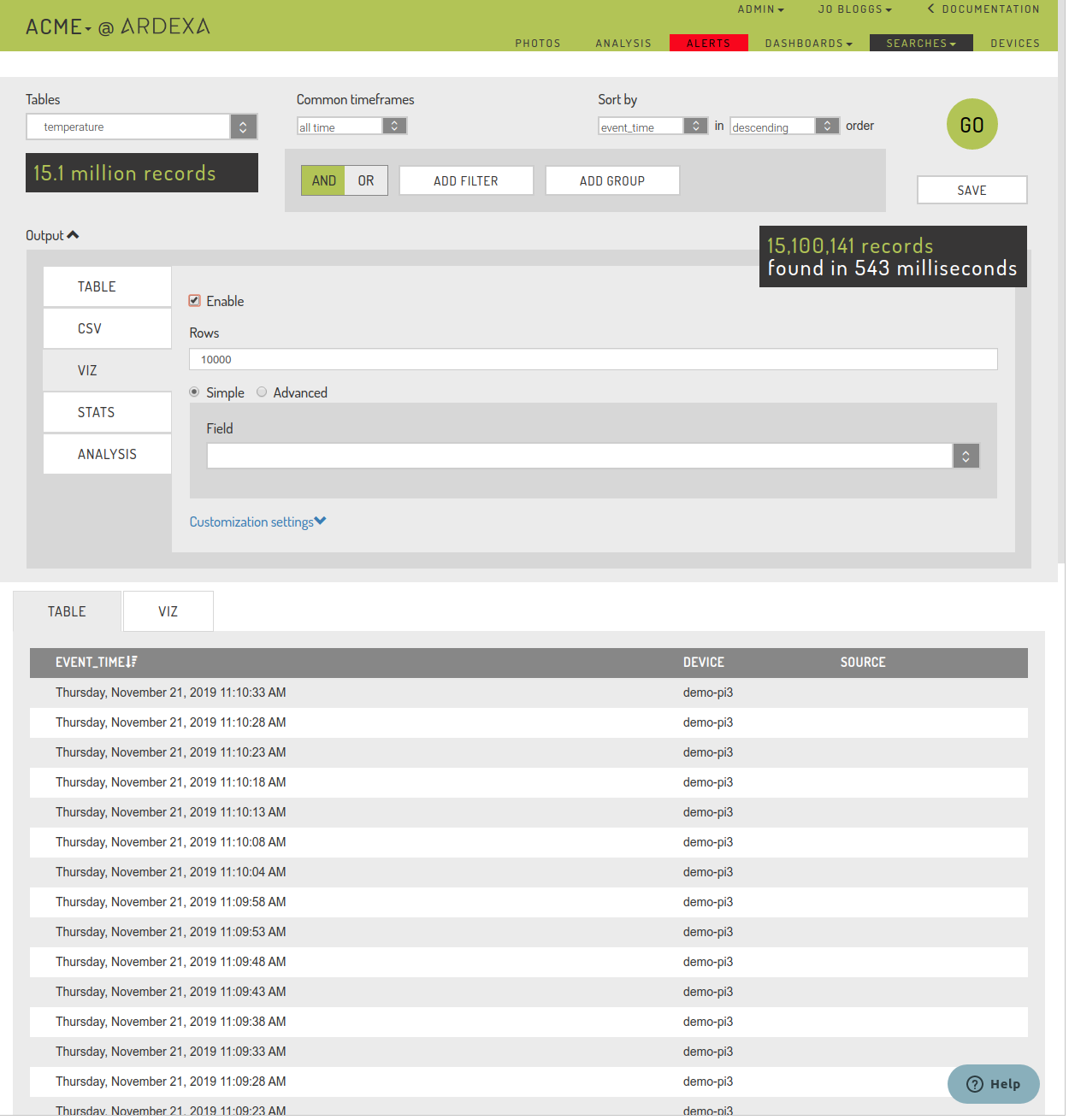
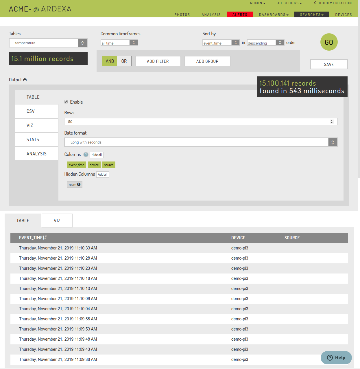
Run a Search
We have to generate some search results for our VIZ, so we run a search to get some results. All the search input parameters will be used to generate the data that the VIZ will be built from.
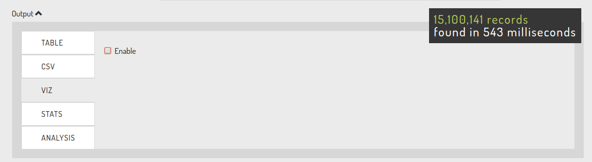
Enable the VIZ for your Search
Select the [VIZ] tab and enable visualisations via Enable checkbox. This allows you to begin building your VIZ.
Build a simple VIZ
Once enabled the simple VIZ output parameters box will appear. Begin to select the parameters you would like to chart. You will note that at this stage the tabulated raw data is still displayed.
At any stage you can switch over to the [VIZ] tab. while you are building your VIZ chart.
You are encouraged to chop and change your search and VIZ parameters on the fly and re-run your search while you refine your VIZ chart.
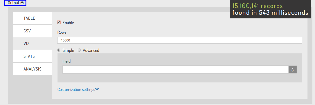
Select your VIZ Output Parameters
Select the [Output] to expand the VIZ output parameters if they are hidden. This is where you will define what the VIZ chart will draw and how it will display.
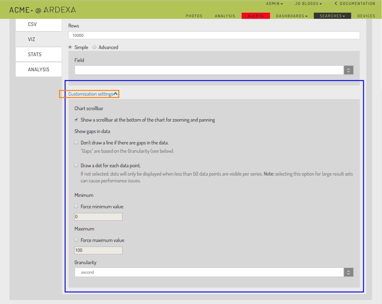
Rows
Limit the number of rows evaluated in the VIZ chart.
Max number of rows that can be included are 10,000 records
Field
Select a numerical field type from the drop-down list.
If you don't see an expected field it will likely mean the field has not be defined correctly in your Ardexa device's metadata.
Advanced vs Simple
Simpleparameters allow you to plot from a single numerical data field defined in your table.Advancedparameters allow you to select from multiple numerical fields defined in your table to have them plot in the same chart. You may add further fields with the[Add dataset]button.
Customization Settings
The [Customization settings] are further parameters provided to help you sharpen your VIZ.
Chart scrollbar
An instant on/off toggle provides you the means of condensing or expanding the graphed period of your search results. For example, say you see an interesting pattern in a period of you graphed search data, using the toggle you can can zoom-in and just focus on that period.
Show gaps in data
Your data may have gaps in its collection. This section gives you options on how you want those gaps in data to be handled in the VIZ graph.
Force Minimum and Maximum chart limits.
Out of the box, the VIZ will automatically chart your data and provide you a
y-axisthat best suits your data for the graph. However, you may want to chart based on fixed periods, for example in units of 10s, in which case you would select a Minimum of0and a Maximum of100.
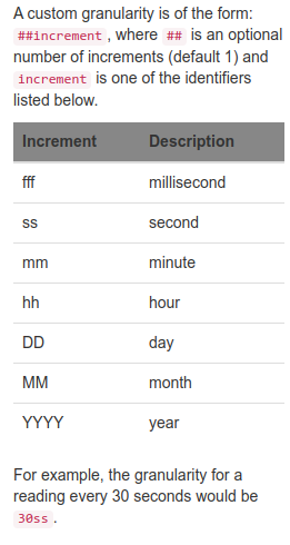
Granularity
Scenario: The frequency your raw data is collected is stored in the underlying table. For this example, every millisecond, but you are only interested in charting and viewing data for every second or perhaps every minute or perhaps per day - will call this
granularity. In this scenario, theGranularityoption allows you to tweak how the graph is drawn.Naturally, you can't expect finer results than the base sampling frequency collected in the underlying table.
Granularity options include:
secondminute5min15minhourdaycustom
The custom value allows for further manipulation of your chart sampling. Selecting this value will display the Custom Value field where you can instruct the granularity to use in the chart, for example a non standard value, eg: every 7 seconds - 7ss
Last updated